
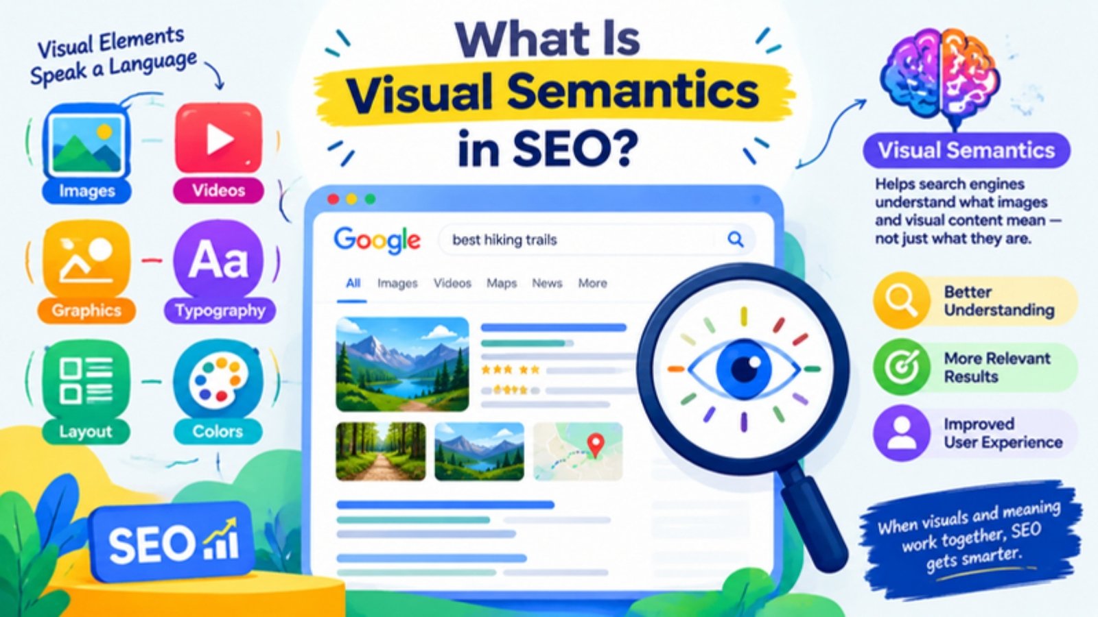
Visual semantics in SEO explains why two pages with the same words can rank very differently. Search engines do not read a page as one flat stream of text. They read its layout first: what is biggest, what sits in the centre, what appears above the fold and what a visitor can actually do there.
This guide defines visual semantics, shows how search engines see layout before text, and walks through the principles, examples from Kerala business websites and dental clinic pages, and a 10-step checklist you can apply to your own pages.
What Is Visual Semantics in SEO?
Definition: Visual semantics in SEO is the practice of using a page’s visual design (its layout, the size and position of each component, interactive elements and structured cards) to help search engines understand what the page is about and which parts matter most. It aligns visual relevance with textual relevance so the page can rank for its target queries.
In plain terms, visual semantics in SEO means that how a page looks is part of what it means. Search engines do not read a page as one flat stream of words. They first divide it into visual blocks, judge which blocks are most important from their size, position and type, and then interpret the text inside each block with that weighting in mind.
The term borrows from linguistics. Semantics is the study of meaning. Textual semantics looks at the meaning of words, entities and their relationships. Visual semantics looks at the meaning carried by layout: what is big, what is central, what sits at the top, what the visitor can do, and how related facts are grouped together.
The five building blocks of visual semantics
| Building block | What it covers |
|---|---|
| Visual hierarchy | Size, centrality and position of each block, which decide how much weight its text carries |
| Centerpiece | The dominant first-screen component that states the page’s purpose |
| Functional elements | Calculators, forms, upload fields, filters and booking widgets that match search intent |
| Attribute annotation | Labels, dropdowns and fields that cover the attributes of the searcher’s expanded query |
| Structured cards | Self-contained units grouping an entity’s attributes, trust signals and an action |
Visual semantics compared with related disciplines
| Discipline | Main question | How it relates to visual semantics |
|---|---|---|
| Textual (semantic) SEO | Do the words, entities and topics cover the query? | Visual semantics makes sure that text is placed and weighted correctly |
| UX design | Can people use the page easily? | Shares the same hierarchy, but visual semantics starts from the search query |
| Conversion optimisation (CRO) | Will visitors take action? | Overlaps heavily; CRO tests persuasion, visual semantics targets relevance |
| Structured data (schema) | Is the content labelled in code? | Schema labels facts in markup; visual semantics labels them on screen |
| Visual search (Google Lens) | Can an image be recognised? | A different topic: it concerns images as queries, not page layout |
Note: Visual semantics in SEO is sometimes confused with visual search or image SEO. Those deal with how images are found and recognised. Visual semantics deals with how the layout of a whole page shapes its relevance.
Why Visual Semantics Matters for SEO
In short: Visual semantics matters because two pages with identical text can rank differently. Layout changes how the text is divided into passages and how much weight each passage receives.
Picture two dental clinics in Thiruvananthapuram, each with a 2,500 word page on dental implants. Clinic A publishes the copy as one long column: an intro, history of implants, the procedure, cost in paragraph eleven, recovery in paragraph fifteen and FAQs at the bottom. Clinic B uses the same words but arranges them differently.
| Element | Clinic A (wall of text) | Clinic B (visually structured) |
|---|---|---|
| Top of page | Stock photo of a smiling model, slogan “Smile with confidence” | Heading, short eligibility summary, cost estimator by number of teeth and implant type, Book consultation button |
| Cost information | Paragraph 11, around 60% down the page | Inside the estimator and repeated in a “Cost” tab directly below |
| Procedure, recovery, risks | Spread across the lower half | Four labelled tabs: Procedure, Recovery, Risks, Aftercare |
| Trust signals | Doctor name in the footer | Card with implantologist photo, qualification, years of practice and cases completed |
| What a visitor can do | Read and scroll | Estimate cost, compare implant types, book, read FAQs by category |
Clinic B has not added a single new fact. What it has done is make the purpose of the page unmistakable, put the highest-intent information (cost, suitability, booking) in the most prominent block, and turn long sections into clearly labelled units. A search system that segments pages visually receives a very different picture from each clinic, even though a word count would call them equal.
How Visual Semantics Works: Search Engines See Layout Before Text
In short: Research on web page segmentation going back more than twenty years shows systems splitting pages into visual blocks and scoring each block by position, size and type. Recent patents extend this to layout-aware models that learn how blocks relate.
Pages are read as blocks, not as one document
In 2003, Microsoft Research published the Vision-based Page Segmentation algorithm, usually called VIPS. Instead of trusting the HTML tree alone, it used visual cues such as lines, white space, colours, fonts and pictures to divide a page into semantically coherent blocks. Microsoft’s own write-up of the work explained that once a page is broken into blocks, each block can be scored against a query: blocks nearer the centre were usually treated as more important, and larger blocks were expected to dominate the overall meaning of the page.
The researchers reported that using these visual blocks to choose query expansion terms improved retrieval performance by 27% on a standard Web Track dataset. A related Microsoft patent on calculating the importance of a block within a display page describes a search engine identifying the most important block of each result and calculating relevance against that block, or classifying a page by the text of its most important block.
Layout-aware understanding today
Google has worked on the same problem from its own direction. Its 2012 Page Layout algorithm demoted pages whose original content was hard to find above the fold because of excessive ads, which was an early, public sign that layout could affect ranking. More recently, a Google patent titled “Layout-aware multimodal pretraining for multimodal document understanding” (US12393768B2) describes models that break a document into blocks such as headings, paragraphs, images and tables, and learn how those blocks relate by their order and position.
Modern retrieval adds one more step. Pages are split into passages (chunks) and converted into embeddings, numerical vectors that can be compared with a query vector. If the segmentation is poor, the chunks are poor: a cost figure ends up mixed with an unrelated story, or a key answer is split across two weak passages. Good layout produces clean chunks with obvious topics.
Note: Google has not published how much weight layout carries in its live ranking systems. The research and patents show that layout understanding exists and is useful for relevance; the exact weighting on any given query is not public. Treat the rules in this guide as well-grounded working hypotheses and measure them on your own pages.
The Three Core Principles of Visual Semantics: Size, Centrality and Position
In short: The biggest, most central, highest component on a page is read as its main statement. Anything small, in a sidebar or near the footer carries little weight.
| Rule | What it means | What to do |
|---|---|---|
| Size | Larger components are read as more important to the page’s meaning | Make the element that answers the main intent the largest block |
| Centrality | Content in the main column outweighs left or right sidebars | Keep primary information out of sidebars and footers |
| Position | Higher content, especially above the fold, carries more weight | Bring the core answer, tool or offer to the first screen |
These rules also match how people behave. Eye-tracking research from the Nielsen Norman Group found that users spent about 57% of their page-viewing time above the fold and about 74% within the first two screenfuls. Search systems and human readers converge on the same hierarchy, which is why fixing it tends to help both rankings and conversions.
Example: Alappuzha houseboat operator
Before: The homepage hero is a full-width drone video of the backwaters with the words “Experience God’s Own Country”. Package prices, cruise durations and boarding points sit in a narrow right sidebar near the footer.
After: Directly under the heading sits a large package selector: day cruise, overnight stay or two-night cruise; number of bedrooms; AC or non-AC; boarding point (Punnamada or Kainakary); date picker; price per boat; Check availability button. The video moves below as supporting media.
Why it works: The largest, most central, highest block now states exactly what the page is for (booking a houseboat) and carries the attributes searchers care about.
Example: Kochi dental clinic, invisible aligners page
Before: The aligner price range and the free scan offer appear in a small sidebar widget beside a 1,500 word article.
After: A central block shows aligner options (mild, moderate, complex cases), typical treatment duration, price range, an EMI note and a Book free 3D scan button. The article becomes supporting tabs below.
Centerpiece Annotation: The Main Statement of a Page
In short: Search systems look for the dominant above-the-fold component to understand what a page is for. If that component is vague, the page’s purpose has to be guessed from weaker signals further down.
Think of the centerpiece as the answer to the question “what is this page?” If the dominant block is a booking form, the page is a booking page. If it is a calculator, the page is a calculation tool. If it is a stock image with a poetic slogan, the system learns almost nothing.
| Kerala page type | Weak centerpiece | Strong centerpiece |
|---|---|---|
| Munnar resort | Mist-covered hills photo with “Escape to paradise” | Room type cards with view, occupancy, inclusions, price per night and a date picker |
| Trivandrum Ayurveda centre | Lotus graphic and Sanskrit quote | Treatment finder: condition, preferred duration (7, 14 or 21 days), residential or day treatment, Enquire button |
| Kozhikode restaurant | Interior photo carousel | Today’s menu highlights, opening hours, table booking, delivery options |
| Kerala PSC coaching institute | Banner of toppers’ faces | Course selector (LDC, LGS, Degree level), batch start dates, mode, fee, Enrol button |
| Dental clinic homepage | “Your smile, our passion” | Treatment search plus three top service cards (implants, aligners, root canal) with starting price and Book buttons |
A practical test: cover everything below the first screen on mobile and ask a colleague what the page lets them do. If they cannot answer in one sentence, the centerpiece is not doing its job.
Functional Elements in Visual Semantics
In short: Pages that let visitors do something (calculate, compare, book, upload, check eligibility) give search systems a clear functional classification. The function has to match the search intent to help.
A useful way to read “helpful content” is to ask what a visitor can accomplish on the page that they could not accomplish by reading a summary somewhere else. Many purely informational sites struggled in recent years because their pages described things without enabling anything. A page with a relevant function has an advantage that more paragraphs cannot copy.
The qualifier matters. A random quiz on a root canal page does not help. The function must match what the searcher is trying to achieve.
| Target query | Matching functional element | Why it fits |
|---|---|---|
| dental implant cost Kochi | Cost estimator by number of teeth, implant brand tier and bone graft need | Cost intent answered with an interactive range |
| braces or aligners which is better | Side-by-side comparison with a 4-question suitability checker | Comparison intent needs a comparison engine |
| dentist open on Sunday Trivandrum | Live opening hours, emergency slot booking, map | Availability intent needs availability data |
| smile makeover Kerala | Photo upload for a preliminary smile assessment | Visitor sees a personalised next step |
| Panchakarma treatment cost Kerala | Package builder by days, room type and therapies | Converts a vague price question into a quote |
| houseboat booking Alleppey | Date, bedrooms and cruise type availability search | Booking intent needs a booking function |
| solar panel subsidy Kerala calculator | Subsidy and savings calculator by roof size and monthly bill | Calculation intent answered on the page |
| Kerala wedding photography packages | Package cards with hours, deliverables, price; date check | Shoppers compare and confirm availability |
Visual Semantics and Query Expansion
In short: Search systems often interpret a short query as a fuller intent. Your centerpiece should contain fields and labels for the attributes in that fuller intent.
Someone typing “root canal” rarely wants a dictionary definition. The intent behind it is closer to “how much will a root canal cost, will it hurt, how many visits will it take, and where can I get it done near me”. Search systems expand short queries in this way. A page competing for that query does best when its centerpiece visibly covers those attributes, in the words people use.
| Short query | Likely expanded intent | Centerpiece elements to include |
|---|---|---|
| root canal | Root canal cost, pain, number of visits, near me | Cost by tooth type (front, premolar, molar), single-sitting option, typical visits, pain management note, location, Book button |
| kids dentist | Gentle paediatric dentist nearby, child-friendly, timings | Age groups treated, first-visit guide, evening and weekend slots, parent reviews, Book button |
| Ayurveda treatment Kerala | Authentic residential treatment for a condition, cost and duration | Condition selector, duration options, inclusions, doctor credentials, price range, Enquire button |
| data science course Kochi | Course with placement support, fees, duration, mode | Mode and duration selector, fee display, placement record, syllabus tab, Enrol button |
| Wayanad homestay | Homestay with family rooms, food, nearby attractions, price | Room cards, meal plan, distance to attractions, price per night, availability check |
Wording matters as much as the fields. If patients search for “single sitting root canal”, the dropdown or label should say exactly that, not “accelerated endodontic therapy”.
Structured Information Cards in Visual Semantics
In short: A card groups the key attributes of one entity (a treatment, package, doctor or course) with a trust signal and an action. Cards create clean, self-contained chunks that are easy for people to compare and for machines to parse.
Cards are probably the most transferable idea in visual semantics. Instead of scattering facts across paragraphs, a card holds everything someone needs to judge one option, plus a way to act on it.
Anatomy of a dental treatment card
| Card component | Purpose | Example: Dental implants |
|---|---|---|
| Entity name | Says what the card is about | Single-tooth dental implant |
| Key attributes | Answers the expanded query | Starting price, number of visits, healing time, suitable for |
| Trust signal | Builds credibility | Implantologist name, qualification, cases completed |
| Social proof | Shows real outcomes | Two-line patient testimonial with rating |
| Action | Gives the card a function | Estimate my cost, Book consultation |
Kerala variations
Example: Ayurveda retreat package card
Package name (14-day Panchakarma), included therapies, supervising doctor with BAMS or MD (Ayurveda) qualification, accommodation type, meals, star rating, a short guest quote, price range and an Enquire button. Repeat the same card structure for every package so visitors can compare like with like.
Example: Tech training institute course card
Course name, duration, online or classroom mode, fee and EMI option, mentor profile, placement statistic with year, one student review and an Enrol button.
Example: Dental clinic doctor card
Doctor photo, name, specialty (prosthodontist, orthodontist, endodontist), qualifications, years of practice, languages spoken (Malayalam, English, Hindi, Arabic for Gulf patients), consultation days and a Book with this doctor button.
Consistency is what makes cards powerful. When every card repeats the same attribute set in the same order, the page reads like a well-labelled table to a machine and like a menu to a person.
Using Tabs and Accordions in Visual Semantics
In short: Long pages bury useful sections far below the fold. Grouping those sections into clearly labelled tabs or accordions near the top makes the subtopics visible early and turns each one into a distinct chunk.
On a long single-column page, the lower sections sit in the least prominent area. Many practitioners report that restructuring those sections into labelled tabs or accordions placed directly after the centerpiece improves how the page matches long-tail queries, because each subtopic becomes a clearly bounded, clearly named unit in a more prominent area.
- List the sections that currently sit far below the first screen.
- Group them by subtopic, for example eligibility, procedure, cost, recovery, risks and FAQs.
- Place them as tabs or accordions directly after the centerpiece.
- Give each tab a descriptive label in the searcher’s language, such as “Is root canal painful?” rather than “Pain management”.
- Keep all tab content in the HTML on page load so it can be indexed on mobile.
Example: Root canal treatment page, Kollam clinic
Sections on single-sitting root canal, cost by tooth, pain, crown after root canal and failure signs were spread across the bottom half. Moving them into five labelled tabs below the booking block means queries such as “crown after root canal necessary” or “root canal failure symptoms” can match passages that now sit in a prominent, clearly labelled area.
Note: Google has stated that, with mobile-first indexing, content placed in tabs or accordions for user experience is indexed and given full weight. So the benefit here is not about hiding or revealing text. It comes from structure: clear labels, clean chunks and placing subtopics in a more prominent part of the page. Content removed from the mobile HTML entirely, or loaded only after a click, may not be indexed at all.
Friction, Testability and Agentic Retrieval
In short: A tool that works without sign-up can be used immediately by people and inspected by automated systems. Login walls hide the function from both.
Consider a transcription site whose whole page is one large upload field. There is no registration, no payment wall and no distraction. Visitors finish their task within seconds, which produces satisfied clicks, and the page purpose is obvious from the centerpiece alone. Sites like this often grow steadily without content changes, because early satisfaction earns more clicks over time.
Search is also moving towards agentic retrieval, where automated systems can interact with a page to understand what it does. A function that works without an account can be inspected; one locked behind registration reveals nothing until a human signs up.
Example: Low-friction functions for Kerala and dental sites
- A dental cost estimator that shows a price range immediately and asks for a phone number only if the visitor wants a callback.
- A Kerala solar installer’s savings calculator that returns subsidy and payback figures without an OTP step.
- An Ayurveda centre’s treatment finder that suggests suitable programmes before asking for an email.
- A clinic’s “Is this an emergency?” checker for toothache that gives clear guidance and an emergency call button.
Visual Semantics and User Engagement Signals
In short: More clicks and longer visits are not always good. Healthy engagement depends on what the page is for.
It is tempting to treat visual semantics as a way to add dropdowns and accordions purely to increase interaction. Engagement only signals success when it matches the job of the page. A calculator should deliver an answer quickly; a long visit with repeated inputs may mean the tool is confusing.
| Page type | Healthy pattern | Warning sign |
|---|---|---|
| Dental cost estimator | Quick result, then booking or exit | Repeated inputs, long session, no booking |
| Houseboat booking page | Dates chosen, availability viewed, enquiry sent | Many clicks, no submission |
| Treatment guide (e.g. gum disease) | Scrolling, tab use, time on page | Quick return to search results |
| Course comparison page | Filter use, several cards opened, clicks to course pages | No interaction with filters or cards |
Note: Chromium, the open-source project behind Chrome, maintains a site engagement score from 0 to 100. Its public documentation describes uses inside the browser, such as allocating resources and deciding on features like video autoplay. It does not document any use in search ranking, so treat it as evidence that engagement is measured, not as proof of a ranking factor.
Visual Semantics vs a Wall of Text
In short: Unstructured text signals low effort and resembles content produced at scale. Purposeful layout, original media and functions are visible traces of real work.
Long content is not the problem. Long content with no visual decisions is. A page that is paragraph after paragraph, with no images of its own, no tables, no grouping and no actions, looks interchangeable with mass-produced articles. Search systems have strong reasons to separate those from pages made with care.
Example: Two Panchakarma guides
Guide A: 4,000 words of plain paragraphs, a stock image at the top, no headings below H2.
Guide B: The same depth, plus a table of the five Panchakarma procedures with purpose and duration, photographs of the centre’s own treatment rooms, a duration selector, doctor cards with credentials, and tabs for preparation, procedure and aftercare.
Guide B shows effort at a glance. Guide A could have come from anywhere.
Visual Semantics Examples: Two Before-and-After Walkthroughs
In short: Applying every rule to one page shows how the pieces combine.
Dental implant page, Thiruvananthapuram
| Area | Before | After |
|---|---|---|
| Expanded query | Not considered | Dental implant cost in Trivandrum, number of visits, pain, who is suitable, best clinic nearby |
| Centerpiece | Smiling stock model | Cost estimator: number of teeth, implant tier, bone graft yes or no; output price range; Book consultation |
| Above the fold attributes | Heading only | Starting price, visits, healing time, EMI availability, rating |
| Cards | None | Single tooth, multiple teeth, full-mouth (All-on-4) cards; implantologist card |
| Depth | Long article below | Tabs: Procedure, Recovery, Risks, Aftercare, FAQs |
| Friction | Phone number required to see price | Range shown first; callback optional |
| Audience detail | English only | Languages spoken listed; section for Gulf NRI patients planning treatment during a visit home |
Homestay page, Wayanad
| Area | Before | After |
|---|---|---|
| Expanded query | Not considered | Family-friendly Wayanad homestay with food, near attractions, price per night |
| Centerpiece | Slideshow of coffee plantations | Room cards (family room, couple room, tree house) with occupancy, meal plan, price, and a date picker |
| Attributes | Buried in “About us” | Distance to Edakkal Caves, Banasura Sagar Dam and Kalpetta; parking; Wi-Fi; Kerala meals included |
| Trust | None visible | Host card with photo and years hosting; guest rating and two short reviews |
| Depth | One long page | Tabs: Rooms, Food, Things to do nearby, How to reach, House rules |
How to Run a Visual Semantics Audit with an AI Agent
In short: Give an AI agent the top eight to ten ranking URLs and ask it to compare only the first screen: centerpiece, information types, possible actions, buttons and co-occurring terms.
Most designers optimise for conversion, colour and typography. Few think about how the first screen communicates function and attributes to a search system. An agent-based audit closes that gap quickly and gives your designer a concrete brief.
Prompt you can adapt
Visit these 10 URLs ranking for “[target query]”. For each, analyse only the above-the-fold area on mobile and desktop. Report: (1) the main centerpiece component and its purpose; (2) the information types shown, such as price, duration, rating, doctor, location; (3) which actions are possible without scrolling: compare, filter, calculate, book, apply, upload, call; (4) the number and labels of buttons and input fields; (5) key terms and entities shown. Then build a comparison table and list the elements that appear on most of these pages but are missing from [my URL].
Read the output for patterns rather than single examples. If seven of ten top dental implant pages in Kochi show a price range, a rating and a booking button on the first screen, and yours shows only a heading and an image, you have found a concrete gap in both text (co-occurring terms) and function (expected actions).
Common Visual Semantics Myths and Mistakes
In short: Most visual semantics failures come from treating design as decoration or from adding interactivity that does not match intent.
| Myth or mistake | Reality |
|---|---|
| Design is only for conversions, not SEO | Layout shapes segmentation and block importance, and Google has said layout changes can affect rankings even when URLs and text stay the same |
| Content in tabs is ignored | Google states tabbed and accordion content is indexed with full weight on mobile, provided it is in the HTML |
| Adding any widget helps | Only functions that match search intent help; a random quiz on a treatment page adds noise |
| A beautiful hero image is a good centerpiece | An image with a slogan states almost nothing about purpose or attributes |
| More engagement is always better | Tools should resolve quickly; long sessions on a calculator can signal confusion |
| Important info can live in the sidebar | Sidebars and footers are read as peripheral blocks |
| Gate the price to capture leads | Hiding the core answer behind a form adds friction and hides function from users and machines |
| Desktop layout is what counts | Mobile-first indexing means the mobile first screen is the one to design first |
How to Implement Visual Semantics: A 10-Step Checklist
In short: Work through these steps in order on any new or existing page.
- Write the expanded query. Spell out the fuller intent, including price, location, duration, suitability or comparison.
- Choose the function. Decide what the visitor should be able to do: calculate, compare, book, apply, upload, filter or find.
- Design the centerpiece. Make that function the largest, most central element on the first mobile screen.
- Label the attributes. Add fields, dropdowns and labels for every attribute in the expanded query, in the searcher’s words.
- Build consistent cards. Group each treatment, package, doctor or course into a card with attributes, trust signal, proof and action.
- Bring depth upward. Move important lower sections into labelled tabs or accordions just below the centerpiece.
- Remove friction. Let the core function work without login or OTP.
- Audit competitors. Run the above-the-fold comparison across the top eight to ten URLs.
- Judge engagement by page type. Quick resolution for tools, deeper interaction for guides and comparisons.
- Brief the designer. Hand over the centerpiece specification and audit findings before visual design starts.
Frequently Asked Questions About Visual Semantics
What is visual semantics in SEO?
Visual semantics in SEO is the use of page layout, component size and position, interactive functions and structured cards so that the visual meaning of a page reinforces its textual meaning and improves relevance for target queries.
What is the difference between visual semantics and semantic SEO?
Semantic SEO works on the meaning of the text: entities, topics and their relationships. Visual semantics works on the meaning of the layout. The best results come when both point in the same direction.
Is visual semantics a Google ranking factor?
Google does not list visual semantics as a named ranking factor. It does use layout in understanding and ranking pages, and research and patents describe scoring page blocks by position and size. Treat it as a set of signals rather than one switch.
Who coined the term visual semantics in SEO?
The phrase grew out of the semantic SEO community and draws on long-standing research into vision-based page segmentation. The underlying ideas are older than the label.
Does Google really look at page layout?
Google has used layout in ranking since at least the 2012 Page Layout algorithm, has said that changing a site’s layout can affect rankings, and holds patents on layout-aware document understanding. The exact weighting in today’s systems is not public.
What is a centerpiece on a web page?
It is the dominant component in the first screen, the block that tells users and search systems what the page is for, such as a booking form, estimator or package selector.
Do tabs and accordions hurt SEO?
Not when the content is present in the HTML on page load. Google has stated such content is indexed and given full weight with mobile-first indexing.
Should every dental clinic page have a cost calculator?
Only pages targeting cost intent need one. A page on gum disease symptoms might be better served by a symptom checker and a booking option.
How is visual semantics different from conversion rate optimisation?
CRO focuses on persuading visitors to act. Visual semantics focuses on making purpose and attributes clear to search systems. The two overlap heavily, but visual semantics starts from the expanded query, not from button colour.
Can small Kerala businesses apply this without a big budget?
Yes. Reordering sections, adding a package card, moving prices out of the sidebar and labelling tabs clearly are inexpensive changes on most WordPress themes.
Does visual semantics help with AI Overviews and LLM answers?
Clean, well-labelled blocks produce cleaner passages, which are easier for retrieval systems to match and cite. It is not a guarantee of citation, but poor structure makes citation less likely.
What This Guide Does Not Cover, and Next Steps
In short: This guide focuses on layout and function. Several related disciplines sit alongside it.
- Technical rendering: how JavaScript-built tools are crawled and rendered, and Core Web Vitals for heavy widgets.
- Structured data: schema markup for services, physicians, offers and FAQs, which complements but does not replace visual structure.
- Topical maps: deciding which pages to build in the first place. Visual semantics decides how each page communicates once it exists.
- Medical content compliance: rules on advertising treatment outcomes and pricing for clinics in India and the Gulf.
A sensible next step is to pick one high-value page, such as your main implant, aligner or Ayurveda package page, run the competitor audit described above, rebuild the first screen using the checklist, and compare Search Console impressions, clicks and conversion data over the following six to eight weeks.
A Note on Evidence
Page segmentation and block importance are well documented in published research and patents, and Google has publicly confirmed that layout can influence rankings. Other points in this guide, such as how much a tab placed higher on a page gains, or why a particular tool site grew, come from practitioner observation rather than confirmed documentation. The businesses in the examples are illustrative composites, not real clinics or companies. Treat the framework as a set of testable hypotheses and measure the results on your own pages.
Conclusion
Visual semantics turns page design into a relevance signal. When the largest, most central block on the first screen states the page’s purpose, carries the attributes of the expanded query and lets visitors act, search systems and people read the page the same way. You do not need more words to get there. You need the right words in the right blocks, grouped into cards and labelled tabs, with the core function free of friction.
Do you want to audit your website’s visual semantics? Contact Prasad Karthik, SEO expert in Kerala, to find out how your key pages measure up against the pages ranking above you.
Sources
- Microsoft Research, VIPS: a Vision-based Page Segmentation Algorithm (MSR-TR-2003-79)
- Microsoft Research blog, New Ways to Search the Web
- Block-based web search with VIPS and pseudo-relevance feedback (27% improvement)
- US Patent 7363279, Method and system for calculating importance of a block within a display page
- Google Search Central Blog, Page layout algorithm improvement (2012)
- Search Engine Journal, Google Says Changing Web Layout Can Affect Rankings
- Search Engine Roundtable, content in accordions and tabs given full weight
- Chromium Projects, Site Engagement design document
- Search Engine Journal, How Chrome Site Engagement Metrics Are Used
- Nielsen Norman Group findings on above-the-fold viewing time (summary)
